I love a good blog design, I really do. Often I’m sucked in to a blog purely for how pretty it looks, not so much for the content. Strange, isn’t it, when it’s supposed to be the other way round?
There are so many ways you can design a blog. You can make it look like a portfolio with lots of photographs, or a magazine for that sharp and chic twist to a professional-looking blog. You can wipe everything out and just have the content without any sidebars for a clean look.
As for me, well, I’ve been designing personal websites for over 10 years now. Mostly for myself, of course, since I don’t believe I’m good enough to actually do it for anyone else. It started in my university days, when Internet Explorer was like, the IN thing to use, and we’d be rocking Windows NT on every cream PC. I did the whole auto-music thing, and back in the day, it was awesome. Everytime someone accessed my website, Richard Clayderman would start playing Ballade pour Adeline. God I was a nerd 😛
So anyway, back to blogging and today’s topic, which is designing your blog. There are so many ways to go about it. You don’t even have to design them from scratch these days. There are heaps of free themes for you to download and use for your blog. After looking at thousands (I kid you not) of websites and blogs for the past 10+ years, there’s a thing or two I’ve learned about designing themes for blogs and websites.
1. Use a simple, streamlined theme. No fuss, no muss. Magazine themes are beautiful and professional-looking, but personally not my cup of tea because I wouldn’t know where to begin. I believe a blog is called a blog for a reason. It’s very important that I make it easy for my readers to know where to start reading on the blog. For this, I chose to use the Thesis framework. It was my first time actually paying for a design, but it was worth it.
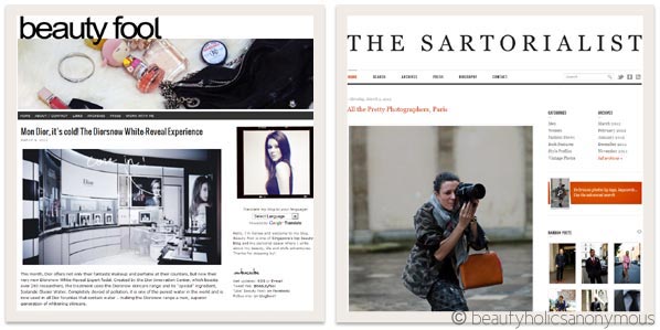
{Beauty Fool | The Sartorialist}
2. Fonts. For text on a blog post, I always stick to a single colour (black) and I keep them the same size. Italics and bold are used sparingly for emphasis. I try not to pepper my posts with them. Handwriting fonts may be cute, but in paragraphs, they are difficult to read and are a turn-off. Oh, and please let Comic Sans die. Please.
3. Keep links easy to find. Underlined links is the usual way to go. This might be a tad odd, but as much as I can, I keep links on a post to a minimum. I don’t normally link to popular brands’ websites like Chanel, MAC, etc because they are well-known enough. I don’t think links to those homepages are necessary. Also, if I have linked to a website once, it’s not necessary to link to the same website within the same paragraph and/or post again. Minimal, prudent links keep the article readable and tidy.
4. Kill the auto-music. As it happens, I found out that not everyone’s a fan of Richard Clayderman. Or Creed.
5. Savour white space. It’s so easy and soothing on the eyes.
6. Break up paragraphs as much as I can. It’s not easy, but I try not to let each paragraph go longer than 5-6 lines. It’s far easier to read and it engages my readers. Humans have shorter attention spans in the age of social media and the Internet. To keep my readers hooked, I don’t only have to create good, original content, I also have to make sure I engage my readers with that content. Unless the post is very interesting, I often find myself scanning the article instead of really delving into it word for word. Especially if each paragraph was 10 lines long.
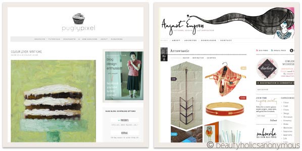
{Pugly Pixel | August Empress}
7. Less is always more. I always have to remind myself not to worry if my blog design, sidebar, footer, header, etc is too simple and bare. Allow the content to stand out.
8. It’s still a work in a progress, but I try not to clutter the blog with heaps of advertisements, e.g. pepper each post with Google Ads, lots of image and text link ads on the sidebar (something I’ve been struggling to manage ever since I started blogging).
Here’s a tip – if you have a number of affiliate links/image ads on your sidebar, do a monthly review of your earnings. If you’re barely making any money, it might be time to reconsider your options. Don’t waste precious real estate (yes, your blog is web real estate) on things that aren’t working for you. Learned that lesson the not-so-sweet way.
There you go, some points I always keep in mind when designing blogs. You may think it’s a no-brainer but sometimes, the design that looks good to you may not be the same for your readers. For example, I once had a charcoal-grey damask background for my blog. I thought it looked so pretty, but after randomly requesting for feedback a few weeks later, consensus was that the damask was too busy and that it was distracting from the content. Ooops.
Moral of the story is – unless you’re blogging for absolutely no one, then you’ve got to keep your audience happy, and make your blog visually-appealing for them to return to.
What about you? What’s your #1 tip to keep your blog visually-appealing?








Omg! I certainly agree with you. Comic Sans fonts drives me crazy! It’s like an itch to the eye. I can’t believe that I used to think it was pretty in my teen-days. Now I look back and wonder, what’s so pretty?
Also agree with the auto-music. Hahahah! I hate those too!! I hate it that I’m trying to read a blog whilst listening to my music, then suddely have to stop my music just to read the blog! I’d hate it anyways even if there’s a play.stop.pause option Y_Y Time consuming for me to scroll down their page to click pause/stop, whatever! 🙁
I’m pretty sure you’ve outlined it all.. I have no tips to contribute! 🙁
I can rant all day about crazy-coloured and inconsistent font-sizes in a paragraph though! 😛
Great post xx
Tram recently posted..BYS Nail Enamel in Pretty As A Peach
Tram: Argh it annoys me big time when I see Comics Sans on anything. There’s this game on the iPad, gorgeous graphics, good gameplay, but of all the fonts they could pick, they used Comic Sans. Made the game look cheap 🙁
I used to use Comic Sans back in the day too. I thought it was cute. Now it’s just an eyesore 😛
The problem with auto-music is that sometimes, you can’t even find the bloody stop button for it. I hate it when they embed the music to the webpage without any way to shut the music off.
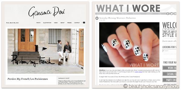
Oh wow I love all the example blogs you’ve posted! They’re so pretty!
I like simple looking blogs as well, so think my blog layout reflects that. I do wish I can pretty it up more or try a new theme though – but don’t have enough tech knowledge to do so 🙁
Tina recently posted..J’adore Les Merveilleuses de Ladurée
Tina: They’re my favourite blogs, pretty eye candy 😛
I love your blog design! Very rarely do I see bloggers, especially beauty ones, omit the sidebar altogether and just shoot us with good content. So keep up the good work!
I totally agree with all of those points, embedded music is the worst – if I open up a blog that has embedded music I will then immediately close it. I’ve found that when I first launched my blog design I’d put tonnes of little widgets in the side bar however as time has gone by I’ve cut everything right down and just keep it all to the bare minimum.
Megan recently posted..Heaven is here, Endota Day Spa has finally opened in Perth!
Megan: Me too. Immediately, no matter how pretty or good the blog is. Music on, and I’m off.
When I first started out, goodness me, I put every little widget I could find on my sidebar too. Mostly irrelevant ones, just to make the blog look, oh I don’t know, credible? Slowed the blog way down, and in time, just looked messy. Best to just keep things to the minimum and what’s relevant 🙂
Amen to no auto-play music. Or any music for that matter. I don’t have speakers (yes strange I know) so technically it doesn’t bother me, but I find it slows down loading and I will click away. I also agree with the link tip. Links should be for emphasis and serve a purpose, not just linking to every damn thing under the sun 😛
I think that by comparison to your examples and to yours, I run a pretty cluttered blog 😉 One more point I might add is consistency. I don’t think it necessary to change up a blog theme or design every 2 months. It bugs me when I go to a blog after a month and no longer find it familiar, because a blog design is also part of the overall “brand”.
Paris B recently posted..Guerlain Lingerie de Peau Foundation and Concealer Compact : Sometimes Love (for the brand) Just Ain’t Enough
Paris B: Haha amen to the links bit. Back in the day, I used to link to those major websites I mentioned, but after a while, I find that it really just isn’t necessary. I mean, who doesn’t know the Chanel website, eh? Unless there’s a specific product/article to link to, then I can’t be stuffed to link them. Too many links on a webpage just looks spammy to me.
Highly agree on consistency! Oooh should have put that in 😛 I do agree, because the blog is , after all, a brand, and if the brand keeps changing, then it doesn’t go well for the blogger. I realised that after I made the decision to change to the Thesis theme and came up with the header. My name cards and the new Facebook (should change for Twitter too, just remembered it’s still in the old design) now reflect the same style and colour theme. Ooooh I’m a “brand”! 😛
I am totally guilty of killing #6… I try as hard as I can to stop myself writing novels but I just get too excited & keep banging on & on & on. I need to learn less is more I think.
Madam M: I think a lot of us are guilty of #6. I used to write long essays too, each paragraph many, many lines, until about half a year ago, I read somewhere that it’s good to keep each paragraph short, just so the reader’s eyes don’t glaze over. It was then when I realised I had to change the way I write because how many times have my eyes glazed over long paragraphs in books, on magazines, on websites? 😛
Amen to all of your points! 😀 Couldn’t have put it better myself.
rinnah recently posted..Davines Melu Mellow Anti-Breakage Lustrous Shampoo and Conditioner
Rinnah: Thanks Rinnah 😀
Oh yay! Seems I found another sucker for well-designed blog layouts! I have always been very picky to my own layout, although I don’t know any web design nor HTML. But with the help of many helpful blogger friends I made since I started blogging, I surely have made quite a progress I think. 🙂
And it seems we are very alike! I love clean and easy-to-read layouts probably the most! Thank you for sharing some lovely blogs (some of which I haven’t discovered yet!), Tine!
Jess recently posted..Coming soon…!
Jess: Oooh how could I forget to add your blog in to the post, Jess, yours is GORGEOUS! I love well-designed blogs. They sucker me in to their blogs, I tell ya 😛
Awww… you are too kind, Tine!
My blog layout is actually still work in progress. I have still so much to learn! Don’t know about you, but I’m always super afraid of messing things up with wrong coding or such, because it drives me crazy! Lol…
Jess recently posted..Coming soon…!
Jess: Oh tell me about it. I’m just like that too! Terrified I’d muck it up 😛
yeah I agree with all your points! Less is more
It is no-no for me to read in dark background blog with small bright striking font. Turn-off
razfira recently posted..Wordless Wednesday #13: Ade Macam Hanis Zalikha tak?
Razfira: Excellent point! Forgot to add that one in too. Bright fonts on dark background. Doesn’t work either.
awesomely put Tine, and yes please – NO MORE AUTO-PLAY MUSIC!! 😀
beetrice recently posted..My skin’s A-OK with the Melvita Cleansing Foam Floral Bouquet…
Beetrice: It’s surprising that even today, in these times, you can still find websites that auto-play music. WHY?!? 🙁
this post comes at a perfect time. i’m re-designing my blog and am looking for tips. i suck at design so i try to keep things as simple as possible.
in addition to music, too much / overuse animations and flashes are annoying too.
coco recently posted..morgana cryptoria lipstick in love lies bleeding
Coco: I agree. Too much animation (especially those emoticons that move, roll around, etc) and flash are distracting. Particularly flash for me, since I use the iPad a lot and I can’t see a damn thing if it’s there 😛 😛
I agree with all your points too, although I’m guilty of #6 at times, especially when I write about ingredients. I try to break up paragraphs as much as I can, but it’s not always possible..
And auto-music is a big no-no. It often scares me lol and besides, I rarely like the songs played so I leave the blog immediately.
gio recently posted..Product Review: L’Oreal Tripla Attiva Latte Detergente
Gio: Yeah I know what you mean. I still have trouble breaking paragraphs up too. I can write long essays if no one stops me 😛
No to auto-play music, too…. it drives me crazy and makes me panic, blindly closing one tab and window after another just to shut the odd music off. ‘Cause sometimes, the music kicks off too loudly and I get disoriented.
Design perspective, I see a fundamental problem with having lots of whites–and that is, the blogger must have attractive, good quality photos since minimalistic designs highlight both and strong points and flaws of the content.
Vivi recently posted..What Do Your Poop and Pee Tell About Your Body?
Vivi: Tell me about it. Especially when you’re at work and randomly hit some website that you thought was safe for work, and then some loud music start blaring, you rush to switch it off, try to close the tab, and then the computer freezes with the auto-music playing like a broken record. Argh!
I agree with you. Lots of photos, good quality ones, does make a simple design look better 🙂
I wholeheartedly concur with everything. Although I do read everything on an RSS reader, and only ever see the website layouts when I care enough to comment on an interesting article, like this 🙂
You just reminded me that I need to somehow fix the annoying RSS feed for my blog — the text is perfectly black on my website but on the RSS feeds numbered paragraphs become purple and bulleted ones become red. I must do some research on that…
Jos recently posted..February Empties
Jos: Aww Jos 😛 My sentiments exactly. I do my daily blog reading on a RSS reader too (mostly on the iPad), but to comment, I will go to the website. To be perfectly honest, there are some blogs out there I prefer to see only on my RSS reader and not the actual website. Content is good, very good in fact, but the designs were just a bit too much for me. You know what I mean?
This is such a well-timed blog post, I’ve just been redoing my site because I changed my theme.
I would add that it’s important to convey some of your personality through a design, and I find this the most difficult. I’ve been trying to get my personality across without everything looking too busy, if that makes sense. I find if I go too minimal, it looks too corporate. I’m still iffy about the background though (any advice?) and I’m not sure if I should keep the header (my old one) or make a new one. Like Paris said, it’s important to present your brand, so I feel like I should keep some things.
I’m in awe of the blogs you mention (not to mention yours as well) that manage to show personality while still being minimal, it’s much more difficult than people think!
Lizzie recently posted..K-Palette 1 Day Tattoo Real Lasting Eyeliner 24h WP(Micro) vs. Dolly Wink Liquid Eyeliner
Lizzie: Excellent point, Lizzie. Should have put that in too. You definitely should inject your personality to your design. It should be YOU. As for background, if you’re not looking into one solid colour, try finding very light-coloured texture background images? That should soften the look, not too corporate-looking.
At the end of the day, it’s your content that makes it stand out, not just your blog design. Your blog design is very pretty, love the header, by the way 😉
OMG.
I thought both Comic Sans AND Auto-Music died with Myspace.
Oh dear.
Love this post Tine – thank you.
Great tips for me to put into place 🙂
Lexi recently posted..Crossing to the Nude side
Lexi: They’re like cockroaches. As much as you try to kill them, the buggers come back 😉
my tip: when putting up archives of the posts on the sidebar, lots of people dont realise the sidebar may not be wide/long enough for the tittle and it is hard to read the titles
elle recently posted..Review: Lioele Secret Pore HD Powder
Elle: Excellent tip, Elle! I made that mistake when I started blogging. The titles were either truncated or too long that they made the sidebar look wonky. Good one 🙂
Hey, this is really helpful! Thank you (:
Maquillageruka recently posted..Ettusais Aqua Splash
My pleasure Maquillageruka! 🙂